A year ago, my friend Dan decided to drop everything about his crunchy San Francisco techie life and move out to semi-rural North Carolina to join Roxanne, then stationed at Fort Bragg, on a startup idea. Supper Meals is a food delivery startup, but unlike the other hordes of crunchy San Francisco-ish food delivery startups that target us lazy / over-worked urban millenials, Supper Meals gives local chefs a chance to shine and delivers wholesome meals to busy, hungry suburbanites – think working parents and the like.
Dan and Roxanne invited me out to help them with some branding and marketing efforts, so I spent a week channeling my inner Chef’s Table by taking photos, filming and editing a few promo videos, and designing a logo. It was amazing to see what the two of them had put together, to meet their customers (no actors were used in any of these videos!), and witness firsthand the difference that Supper Meals brought to their small community. This also goes without saying, but the Supper Meals I ate that week were absolutely fantastic – I only wish I could get them over here!
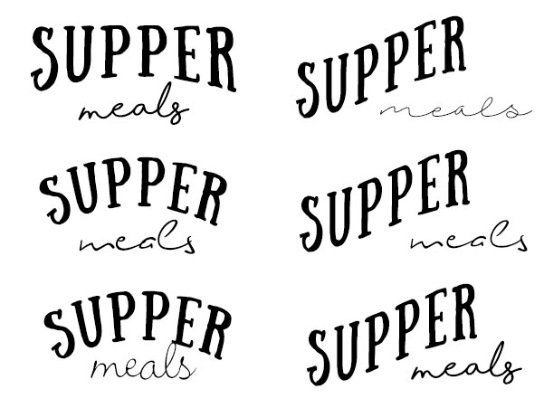
For the logo, we wanted something cozy and homey, but also polished and clean. We started by playing around with fonts and layouts:
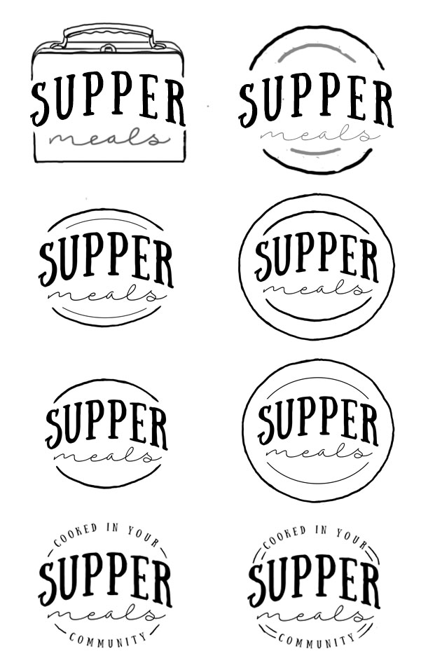
Once we settled on a general layout, we wanted a graphic element to frame it. We quickly settled on the idea of a circle, resembling a plate, but it took a while to figure out how to do it so that it didn’t look too much like a hamburger or a basketball:
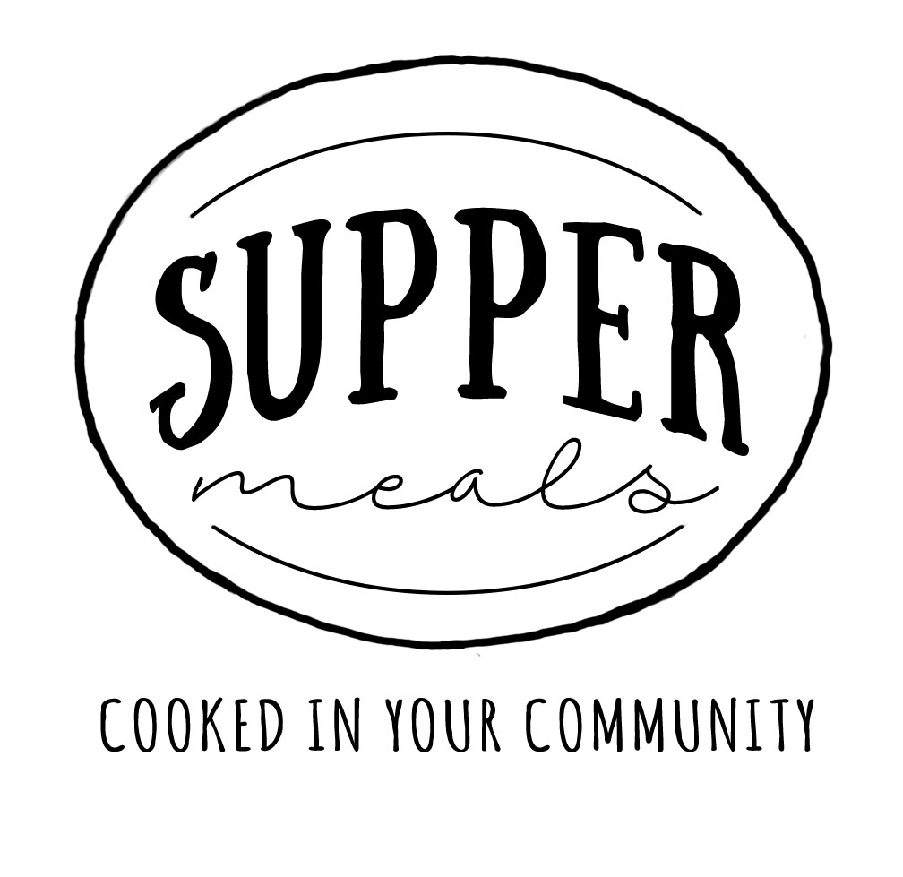
Here’s the final result:
Thanks, Supper!


Dan and Roxanne
Thanks, Cindy! We remain so grateful for all the work you did, and we love our logo!