


When I called the team together for our first meeting after the new year, I was totally unprepared – I hadn’t even listened to any of the music beforehand. My energies had been drained by a few other projects, and all I could muster were a few “princess-y” keywords – crowns/tiaras, castles, dresses, Disney. Thankfully, Ben ran with the idea and put together this awesome mockup:

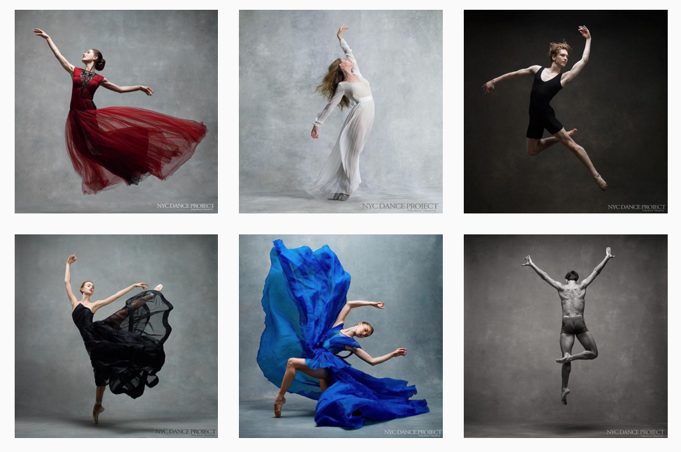
The fabrics and the motion tied the design to Sleeping Beauty and Cinderella’s ballet origins. We drew additional inspiration from the gorgeous swooshy action shots of dancers taken by the folks behind NYC Dance Project (you should follow them on Instagram!):
From this, we knew that we wanted something that conveyed both elegance and motion. But of course, the question remained: how? We weren’t pro photographers, we didn’t have access to professional dancers, and we didn’t really know anyone who had these kinds of swooshy outfits. We actually made Irene grab one of her dresses so that we could take a phone picture and play around with layering it on Photoshop, but sadly our mediocre Photoshop skills also gave us very mediocre results (so much that I didn’t even save the attempts), and we quickly scrapped that idea.
So we had to get creative. I tried using a dress I found on Flickr (creative commons is your friend!), but it felt too heavy. Ben tried a bunch of smoke brushes, which felt a little light, while Jessica and I tried some other fabric brushes (Photoshop brushes are your best friends!) until we finally found a set that we liked. I made a background texture with Photoshop’s fibers filter to give it a more vintage look, and we spent a long time speculating colors (bright vs. earthy?).


When it came to fonts, we couldn’t really agree on a single font that could represent all three pieces – check out all the different styles we tried above. Sleeping Beauty is your classic romantic Russian ballet, which called for something cursive-y and elegant, but Cinderella has Prokofiev’s signature ethereal whimsy, and Concerto for Orchestra features rougher atonal textures. The script fonts looked too frilly and perfect, while others seemed too modern and rigid. I took out my calligraphy pens, a recent purchase prompted by the onslaught of friends getting married (scary) and asking for help on save-the-dates and invitations (fun), and took a stab at writing it out by hand. That gave us a lot more flexibility to try other styles – notice how the Cs in Cinderella and Concerto are quite different.


A final “how does this look?” appeal to Alia and Tammy gave the criticism that the poster seemed too busy, so I made some final adjustments to the informational text, and voila!

UCBSO Design Team: Ben Taube, Irene Kim, Jiazhen (Jessica) Chen.
(P.S. Go to the concert!)
Leave a Reply