


When I started working on this poster for UCBSO’s epic season finale of Mahler’s 9th Symphony, his very last, I started with a word association list to brainstorm ideas for poster themes. Looking back at it afterwards, it read remarkably well as bad poetry written by a heartbroken, emo teenager:
DEATH
grim reapers
drama
reaching for something but not quite getting it
acceptance
release
transcendence
eternity
something beautiful shattering
rage
brooding
…you get the idea. It was difficult to come up with something simultaneously contemplative, dramatic, and emotionally intense. Silhouette of old person looking out a bright window? Seasoned, tired hands with dramatic wrinkle lines? A shattering heart?!
The shattering idea was actually borrowed from the New Zealand Symphony Orchestra, who made this video to depict Mahler 9. In their version, delicate white lilies [dipped in liquid nitrogen] break and shatter:
(The NZSO made a bunch of really amazing videos to promote their 2014 season. They’re probably one of my biggest inspirations.)
The beauty of this video is the reality distortion that hits you right at the moment of impact, when you suddenly realize that the petals of the flowers are not as soft or delicate as you had originally imagined. I couldn’t imagine anything else more fitting for Mahler, a composer who has a way of expressing ordinary feelings in the most extraordinarily poignant ways. The poster had to do the very same thing.
So we went down the rabbit hole of youtube and ideas. Here’s an approximate roadmap:
– smashing a cheap violin (too violent)
– things shattering unexpectedly
–> throwing hot water into cold air and it turns into ice? (we don’t live in Minnesota)
–> supercooled water that solidifies on pouring? (cool to watch at but not very pretty as a still image)
–> superhydrophobic surfaces that make water into droplets? (but how?!)
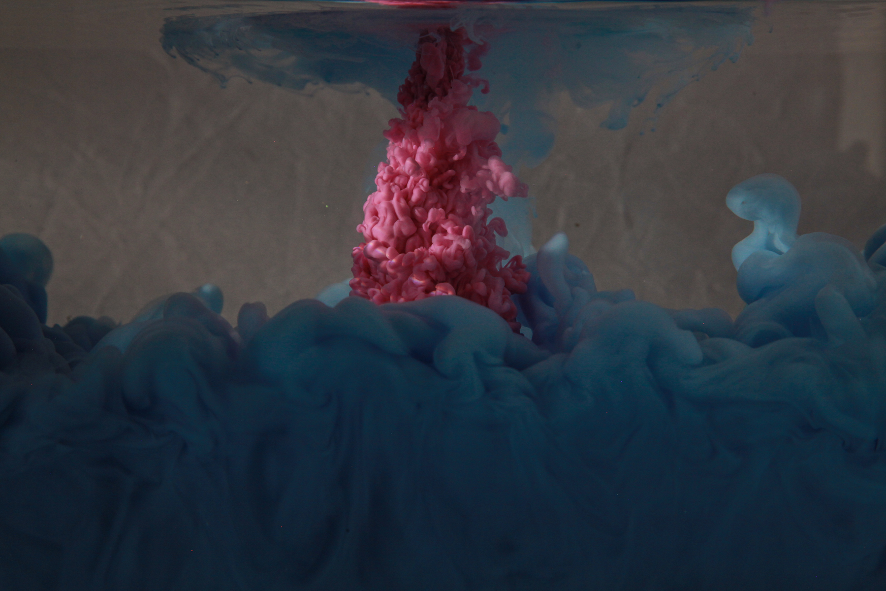
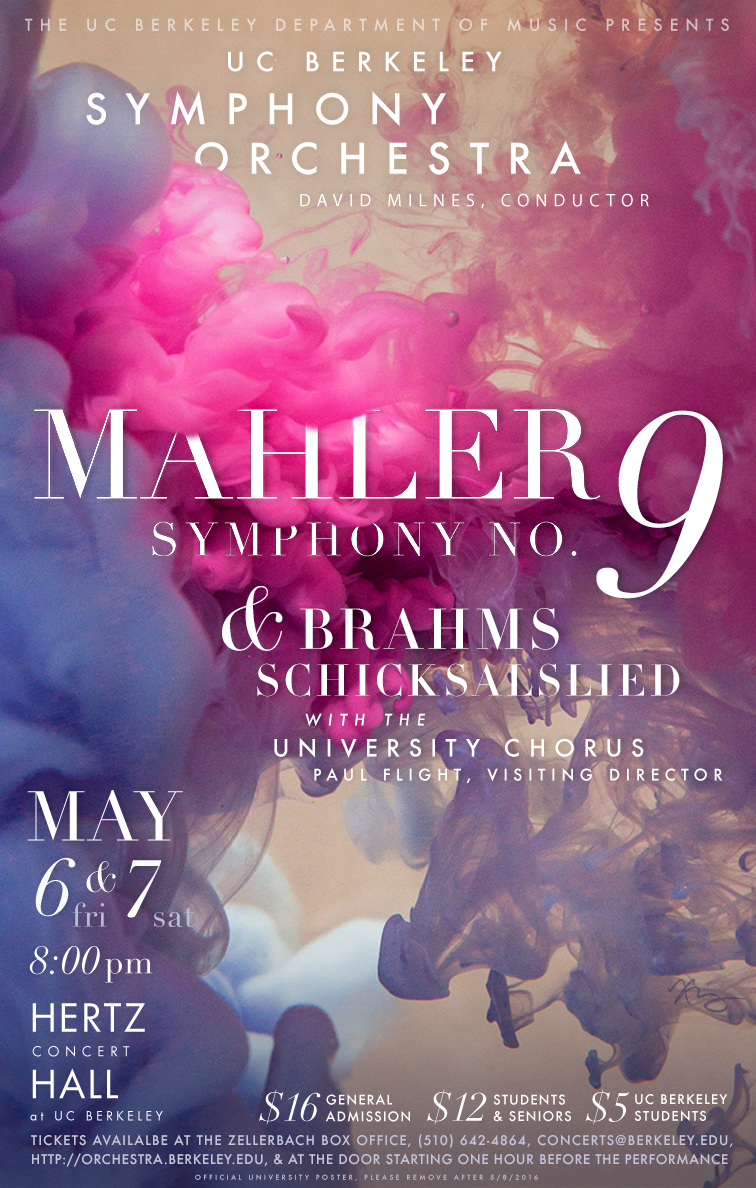
–> pouring ink into water? (BINGO)
It was 2am, and my roommate Sam and I got so excited that we got a vase, filled it with water, and put in a few drops of my calligraphy ink. It was mesmerizing.

I knew that was the look I was going for. After reading a lot of online tutorials, I assembled the Design Team in my living room, and we spent a long evening figuring out the logistics of how to make it work. For the “ink,” we used half and half – in addition to having the right texture, the opaque whiteness also brought out the colors. We mounted a camera on a tripod, played around with the positioning of the lights and reflectors to eliminate glare, and tried to find that sweet spot between having a fast shutter speed vs. a wide aperture for maximum clarity.
One thing we did not anticipate, however, was how long each shot took – in addition to filling and refilling glass containers with water, we also had to wait for the water to completely settle (no bubbles!) before taking each shot. We also used a scrub brush to wipe away any bubbles that stuck to the inside surface of the glass, and we used a lot of windex to remove streaks from the outside of the glass.


We took a bunch of really great videos that day, one of which ended up being the trailer video (scroll down to the very bottom). But none of them had the right resolution or lighting to actually end up as the background image for the poster – everything was too fuzzy because my lamps I got still didn’t produce enough light to capture everything quickly and crisply. I had to go back again and do it during daylight.


I took this image from the middle of the series above – it seemed the most dramatic and turbulent. But it looked pretty normal when it’s rightside up, like in this earlier draft:
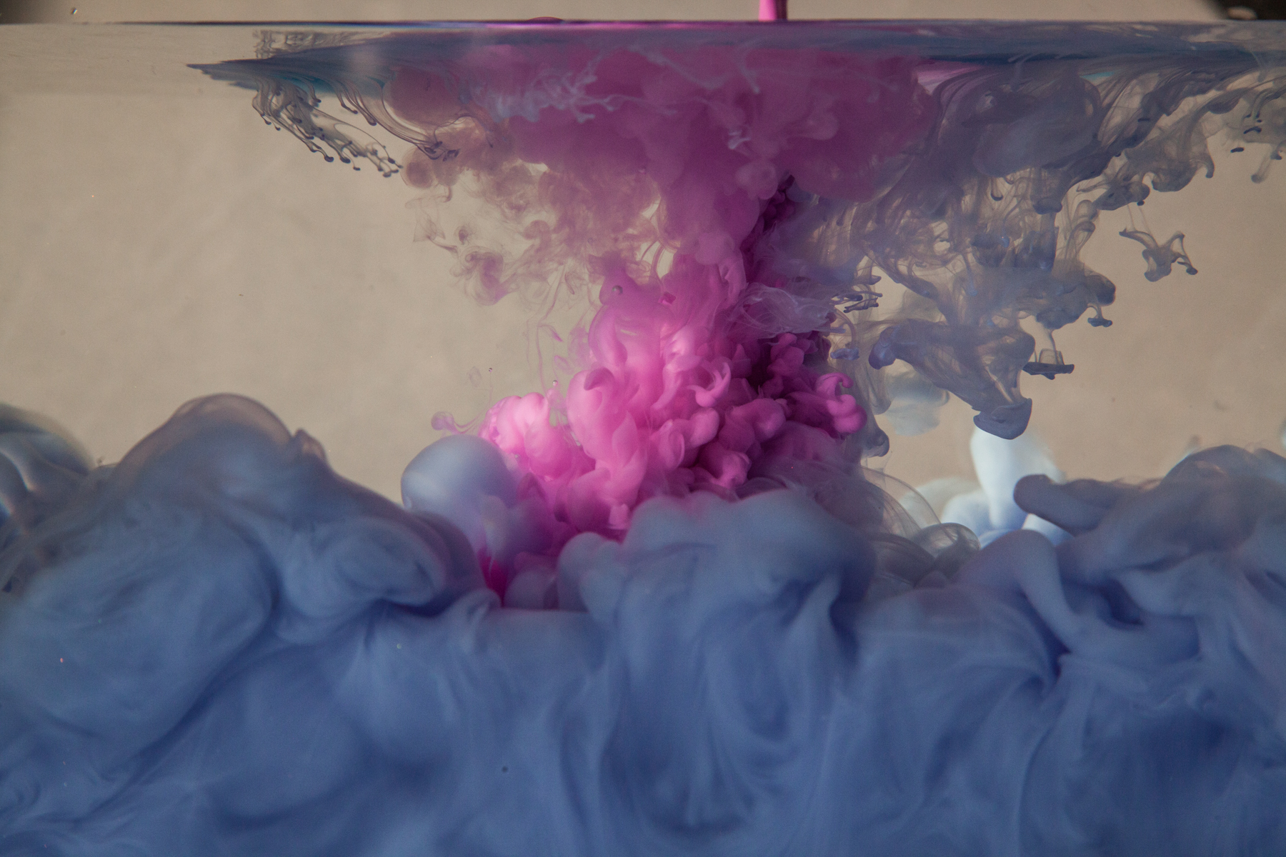
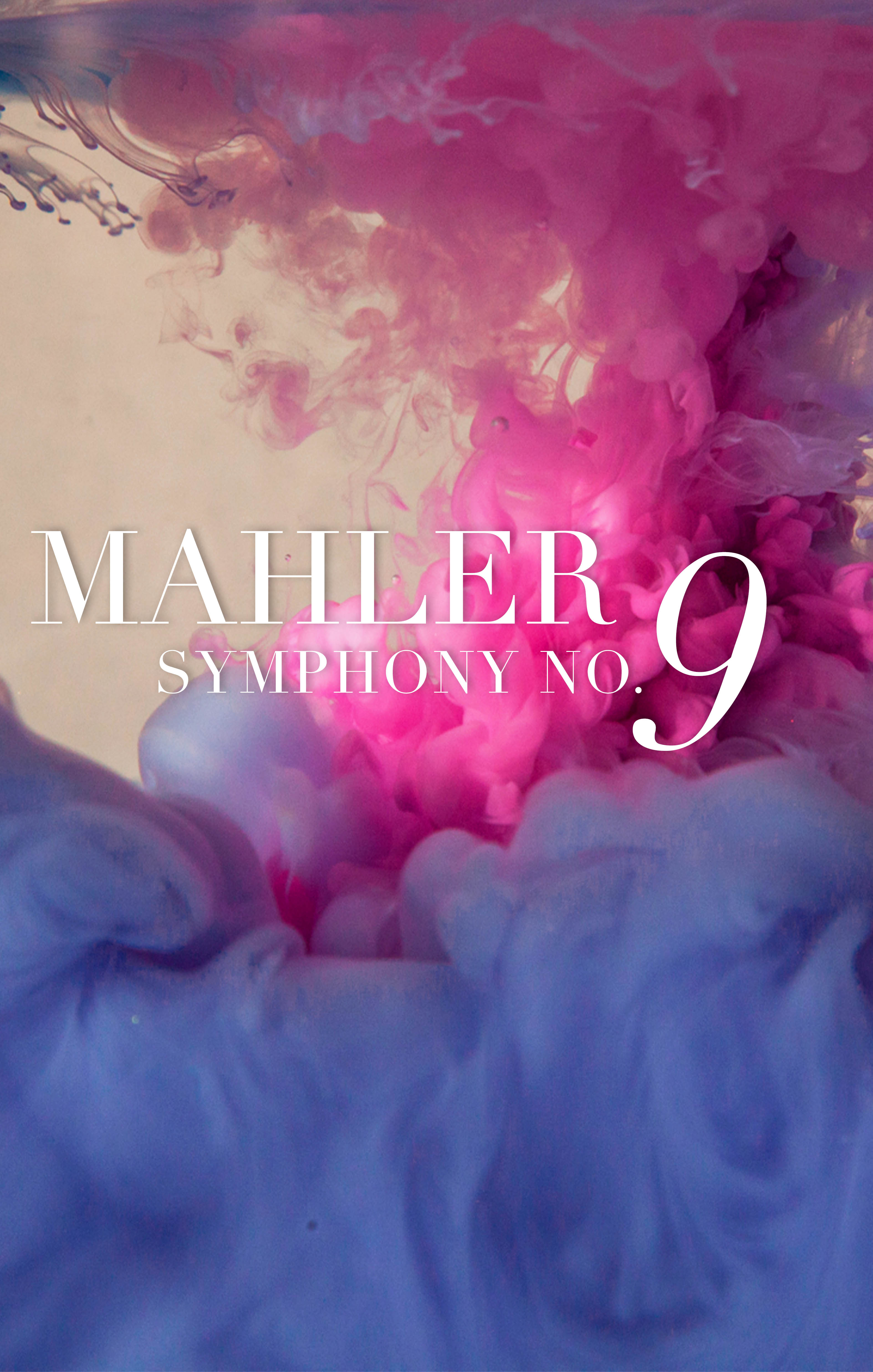
Turning it over on its side, though, made it much more mysterious and transcendent:

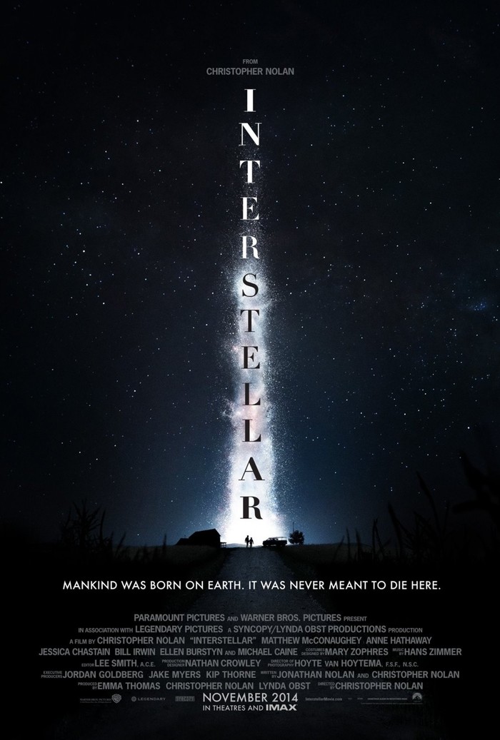
I got the inspiration for the font choices from the San Francisco Ballet, whose graphics always have impeccably fresh designs – for instance, I love the use of negative space in their logo. Their season programs heavily featured the ultra-thin ultra-sleek Didot juxtaposed with a more regular sans serif, which was exactly the look I was going for here. Turns out the fonts I used here were also the same fonts on the Interstellar posters – all a coincidence, I swear!
To add more dimensionality, I erased away some of the edges of the letters to make it look like the words were interacting with the ink.
And here’s the trailer video, paired with a recording of UCBSO performing the symphony in May 2011:
UCBSO Design Team: Irene Kim, Jiazhen Chen, Ben Taube.
Special thanks to: Samantha Raja, Jeremy Amon, Rebecca Lamothe, Jon McMurry.
vanessa aldrich
I’m late-but this is beautiful work,and I may reach out for help with my upcoming performance.
cintwan
Vanessa – thanks so much, and of course! I’m always happy to hear about and collaborate on new projects.